

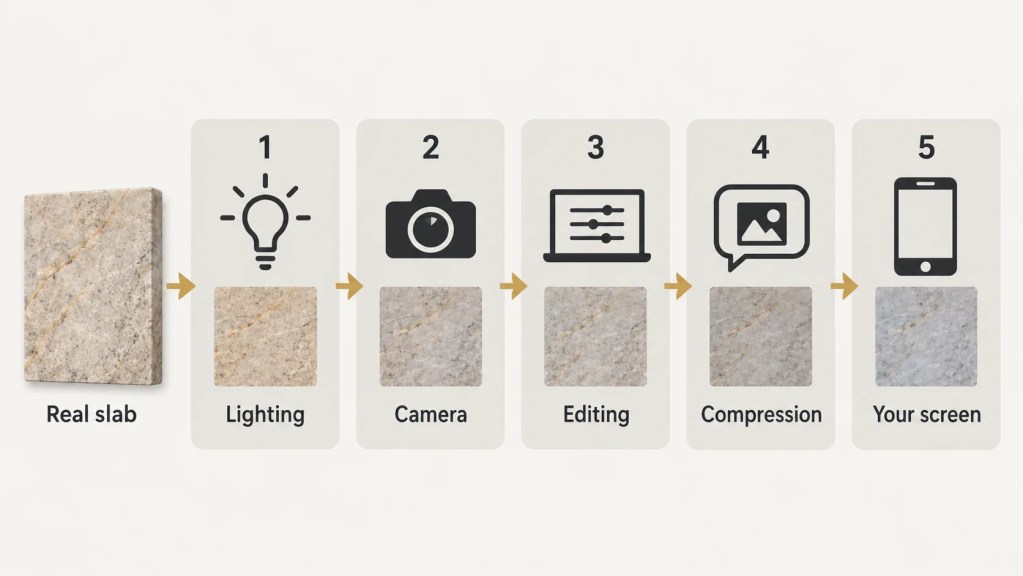
Your countertop colour can look different from the photo because several things can shift the colour before the image reaches you: the lighting and camera when it was taken, any editing afterwards, and the screen or printer you view it on. A photo alone can’t tell you how far the colour has moved from the real stone. That’s why a “warm cream” quartz you picked on your phone can turn up looking cool grey in your kitchen.
It’s one of the most common complaints we hear after installation, and it’s usually avoidable. Here’s what can happen between the slab and your screen, and what to do if your countertop is already in.

Key Takeaways
- No two screens show the same colour. Phones, laptops and monitors all differ in brightness, colour tuning and display mode.
- Supplier photos aren’t always neutral. Warehouse lighting can tint a slab, and while some editing corrects that, other editing makes the stone look better than it does in person.
- PDF catalogues add another layer of distortion, especially once printed.
- Stone photos can’t show scale, veining spread, finish or how the slab reacts to your kitchen’s lighting.
- Use images to shortlist colours. Check a physical sample at home for lighting and surroundings, and view the allocated slab for pattern and variation.
- If your installed countertop doesn’t match what you agreed, compare it with your quotation and sample, then ask your supplier to check.
Why Does the Same Stone Look Different on My Phone and Laptop?
Because every screen reproduces colour its own way. Displays differ in how they’re built, the range of colours they can show, how they’re tuned at the factory and how bright they are, so the same image file can look warmer on one device and cooler on another (BenQ).
Many phones and TVs also ship in a “vivid” mode that makes colours stronger and contrast higher to look impressive in the shop. Add Night Shift or a blue-light filter, auto-brightness, or scrolling through catalogues at 11pm with the screen dimmed, and the “white” you’re looking at might not be white at all.
Think of it like asking five friends to hum the same song. The tune is recognisable, but no two versions sound quite alike. Your screen is only one of those five friends.
Is the Supplier’s Photo Accurate in the First Place?
Not always. Before the image reaches your screen, the lighting, any editing and the camera itself can all shift the colour.
Poor lighting where the photo is taken
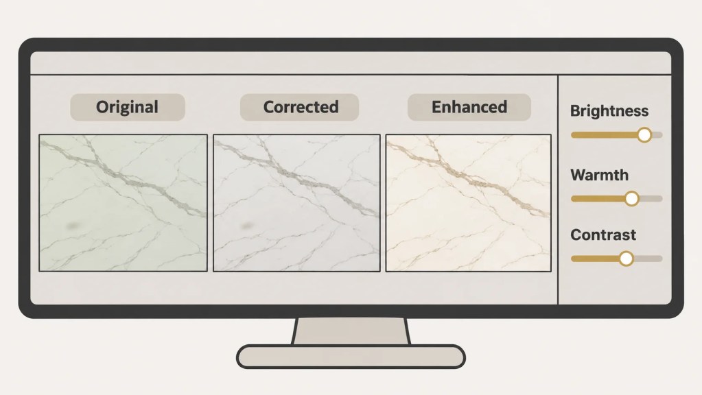
Many stone slabs are photographed in warehouses, factories or open yards. The lighting there is rarely controlled: dim fluorescent tubes, a mix of daylight from the loading bay and yellow overhead lamps, or harsh afternoon sun. The camera captures all of that as unwanted colour tints and shadows. A white slab photographed under old fluorescent tubes can pick up a green tinge, while one shot in the evening sun can look creamier than it really is.

Editing that corrects colour, and editing that changes the stone’s look
Not all editing is a problem. A careful editor may remove the tint left by warehouse lights, which brings the photo closer to the real slab. Enhancement is different: brightening the image, warming or cooling the tone, boosting contrast so the veining pops, or cleaning up marks can make the stone look more attractive than it does in person. You usually can’t tell from the photo which kind of editing it has had. Heavy enhancement is the stone equivalent of a food menu photo: the burger is real, but it never arrives looking quite like that.
Automatic camera adjustments and image compression
Even without editing, phone cameras automatically adjust colour, brightness and sharpness. The file then gets compressed, or shrunk, when it’s uploaded to a website or forwarded on WhatsApp, which strips out subtle tones and flattens fine veining. Soft grey-beige and pale beige are usually the first casualties.
Can I Trust a PDF Catalogue for Stone Colour?
A PDF catalogue is useful for browsing the range, but not for confirming colour. On screen, it carries every problem mentioned above. Printed, it adds more: office and home printers convert colours to ink, and paper type, ink levels and printer settings all change the result. Some stone tones, especially very soft whites and deep blues, simply can’t be reproduced accurately with standard printing.
If a colour looks slightly off in a printed catalogue, it’s the catalogue that’s off, not necessarily the stone.

What Can a Photo Never Show You?
Even a perfectly accurate photo leaves out details that change how a countertop looks in real life.
| What you need to judge | What a photo shows | How to check it for real |
|---|---|---|
| Colour | One version, which the camera, editing and screen can all shift | A physical sample, seen in person |
| Scale of veining | Shrunk down to fit your screen | The allocated slab, viewed in person, shows how the pattern spreads across a 3-metre island |
| Finish | Flat image, reflections hard to read | A sample shows how a polished, honed or leathered surface catches light |
| Variation | One sample from one slab or batch | The slab allocated to your job, or a sample from the relevant batch, viewed in person |
| Your lighting | The photographer’s lighting | A sample at home, under your kitchen’s lights and daylight, next to your cabinets |
Veining is a good example. A pattern that looks subtle in a thumbnail can look bold once it runs the full length of your countertop, and vice versa. Finish matters too. Our stone finish guide explains how polished and honed surfaces reflect light differently, which changes how dark or dramatic the same colour looks.
Natural stone like granite and marble also varies from slab to slab, and even engineered quartz can shift slightly between production batches. A catalogue photo only shows one of them, and a showroom sample or a different slab can’t confirm what you’ll get either. For that, you need to see the slab allocated to your job or a sample from the relevant batch.
How Should I Choose a Countertop Colour Instead?
Use photos to shortlist, then confirm with the real thing. There are two separate checks: a sample at home tells you how the colour works with your lighting and surroundings, and the actual slab tells you about its overall pattern and variation. Neither replaces the other. Here’s a simple process that avoids surprises.
- Shortlist online. Use websites, Instagram and PDF catalogues to narrow down to two or three colour families you like.
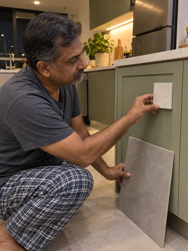
- See a physical sample. Visit the showroom and look at real samples, ideally near a window as well as under indoor lighting. Remember that showroom lighting isn’t your kitchen’s lighting.
- Check the sample at home. Take the sample home and place it next to your cabinet door, floor tile and wall paint. Look at it in the morning, at midday and at night under your actual kitchen lights. Malaysian homes with a wet kitchen near a window and an enclosed dry kitchen can see two quite different results. This is the step that tells you how the colour will look in your space.
- View the actual slab. For natural stone especially, ask to view or reserve the specific slab for your job before confirming. This is where you judge the overall veining, pattern and any variation across the slab, which a small sample can’t show. We cover the limits of a sample chip in why you shouldn’t choose a countertop from a sample only.
- Confirm in writing. Once you’re happy, note the colour name, code and slab or batch number on your quotation, and keep your sample.
If you’re still working out which material to shortlist in the first place, our guide to kitchen countertop materials in Malaysia compares the main options side by side.
My Countertop Is Already Installed and Looks Different. What Now?
Photography explains a lot of colour surprises, but not every mismatch comes from a photo. The stone supplied could also be a different colour code, batch or slab from the one you agreed. Before drawing any conclusion, work through these checks.
- Check your paperwork. Find the colour name, code and any slab or batch number on your quotation or invoice, and compare them with what the installer or supplier recorded for your job.
- Compare it with your sample. If you kept the sample you approved, place it directly on the installed countertop. If the two match closely, the difference is most likely between the photo and the stone, not the stone itself.
- Look at it under different lighting. View the countertop in morning daylight, at midday and at night under your kitchen lights. A colour that looks wrong at night under warm downlights can look as expected in daylight.
- Take clear photos. Photograph the countertop and your sample side by side in daylight, with your kitchen lights off, so the supplier can see what you’re seeing.
- Ask your supplier to investigate. If the difference remains after these checks, or you have no sample to compare against, contact your supplier with your quotation and photos and ask them to check whether the stone supplied matches what was agreed.
Why Does This Matter So Much for a Countertop?
Because a countertop is expensive and permanent. It’s cut to your exact layout, so if the colour isn’t what you expected, there’s no easy exchange. Replacing it means paying for a new slab, new fabrication and new installation. Our stone countertop cost guide shows how quickly that adds up.
A trip to the showroom costs an hour. Living with a colour you don’t love costs you every time you walk into the kitchen for the next 15 years.
FAQ
Why does my quartz countertop look different from the picture? Your quartz can look different because the picture may have been affected by the photographer’s lighting, the camera, any colour editing, and the screen you viewed it on. Your kitchen’s own lighting and surroundings then change it again.
Can I choose a countertop colour online? You can shortlist a countertop colour online, but you shouldn’t confirm it online. Always see a physical sample, and for natural stone the actual slab, before signing off.
Why do stone colours look different on my phone and my laptop? Stone colours look different across devices because each screen has its own brightness, colour tuning and display mode. Features like Night Shift and blue-light filters shift colours further.
Is a printed stone catalogue accurate? A printed stone catalogue is not colour-accurate. Printer inks, paper and settings change the result, and some stone tones can’t be printed accurately at all.
Can Sinno send me photos of my actual slab? Yes, we can share photos or video of the slab allocated to your job, but treat those as a guide too. Viewing the slab in person is the most reliable way to confirm colour.
Conclusion
A photo of a stone countertop is a starting point, not a final answer. Between warehouse lighting, photo editing, automatic camera adjustments, image compression and your own screen, the colour you see online may have moved some way from the real slab. Use pictures to narrow your choices, check a physical sample at home under your own lighting, and, wherever possible, view the actual slab allocated to your job for its pattern and variation. If your countertop is already installed and looks wrong, compare it with your quotation and sample before asking your supplier to check.
Not sure between two colours you’ve spotted online? Drop by our showroom in the Klang Valley and we’ll pull out the real samples so you can compare them side by side.